Column width can be easily changed by applying a preset, or by customization. The options available for column sizing are designed to meet a variety of formatting needs, including text wrapping for column and row headers. These tools give you flexibility and control over the look of your grid and ensure legibility.
Column size formatting can be set for matrix grids, tabular grids, and raw results grids, although not all functionality is available in all cases.
Changing Column Widths on the Canvas
Single Column Width
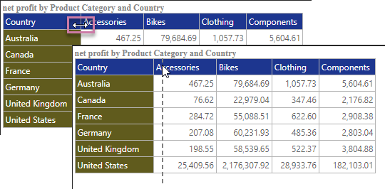
For all Grids, column widths may be increased or decreased on the canvas. Hover over the border of the column header until the cursor appears as a double arrow (purple highlight below), then click and drag your cursor to the left to shrink the column, or to the right to enlarge it.

Multiple Column Widths
You can also use the preceding functionality to resize multiple columns in one action:
- Select multiple columns by
Ctrl+clicking the column headers. - Click and drag your cursor to the left to shrink the columns, or to the right (purple arrow) to enlarge them.
The change applies evenly to all of the selected columns:

Combined Row Width
In Matrix Grids, you can also customize the combined row width; that is, the width of the row headers in combination. This is useful if you have a large grid containing several row header columns, and you want to ensure all columns are visible.
To customize the combined row width, hover your cursor over the border between the right-most row header and the left-most data column. A double-headed arrow appears (purple arrow below); drag the arrow to increase or decrease the total row header width.

Note: Depending on your grid row settings, a scroll bar may appear at the bottom of the grid (green arrow above).
Column Sizing Menu Options
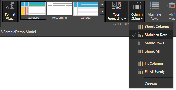
The Column Sizing dropdown list features several preset options that determine the width of the grid's columns and whether the column or row width should continue to be customizable. This dropdown list can be found in the Formatting panel and the Component ribbon.
Formatting Panel
The Column Size dropdown list is located on the Settings tab of the Formatting panel for Matrix Grids, Tabular Grids, or Raw Grids. For a description of each of the Column Size preset options, see below.

Component Ribbon
Open the Column Sizing dropdown list from the Component ribbon and select the required preset option. Alternatively, select Custom to customize column widths. For a description of each of the Column Size preset options, see below.

Note: The preceding example shows the Column sizing for a Matrix Grid. For Tabular or Raw Grids, Columns, Rows, and Data options are replaced by Measures.
Column Size Preset Options
Common options
Shrinks all columns, including row header columns, to the minimum width possible for the text contained in the row and column headers. Any previous or subsequent customization made to columns is overridden.

Expand or shrink columns, including row columns, to fit the canvas or panel that contains your grid. Note that the columns are all equal widths after this option has been applied.

Customize the width of any columns in the grid. Any custom changes are saved after selecting a different column sizing mode; this means that, if you switch back to custom, your previous custom selections are used.

Set the exact width for all columns in the grid by selecting Exact Width as the column size and entering the required size in pixels:

Matrix Grids only
Shrinks the grid's columns to the minimum width possible given the text they contain. Any previous or subsequent customization made to columns is overridden, the ability to customize the width of the row headers column is retained.

Shrinks the data columns to the minimum width possible for the text contained in the data cell. If the header exceeds this length, text wrapping is applied (purple arrow below). Columns of row headers shrink to the minimum width possible for the contained header text. Any previous or subsequent customizations made to columns are overridden.

Shrinks the grid's row header columns to the minimum width possible for the text they contain.

Expand or shrink columns to fit the canvas or panel that contains your grid. Changes made to the column width are ignored.

Raw and Tabular Grids only
Shrinks the grid's measure columns to the minimum width possible, given the text they contain. Any customizations made to columns is overridden. The ability to customize the width of the row headers column is retained.

Expand or shrink any measure columns so that the grid fits the canvas or panel. You can change the widths of the individual columns, but not the overall width of the grid.

Publish and Present: Grid Size Settings Dialog
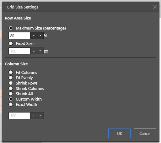
In Publish and Present, you can also update the Column Size from the Grid Size Settings dialog:
- Click here for more information about Grid Sizing in Present
- Click here for more information about Grid Sizing in Publish
